Welcome Popup: Examples & How to Make [Guide + Templates]
Read summarized version with
Welcome!
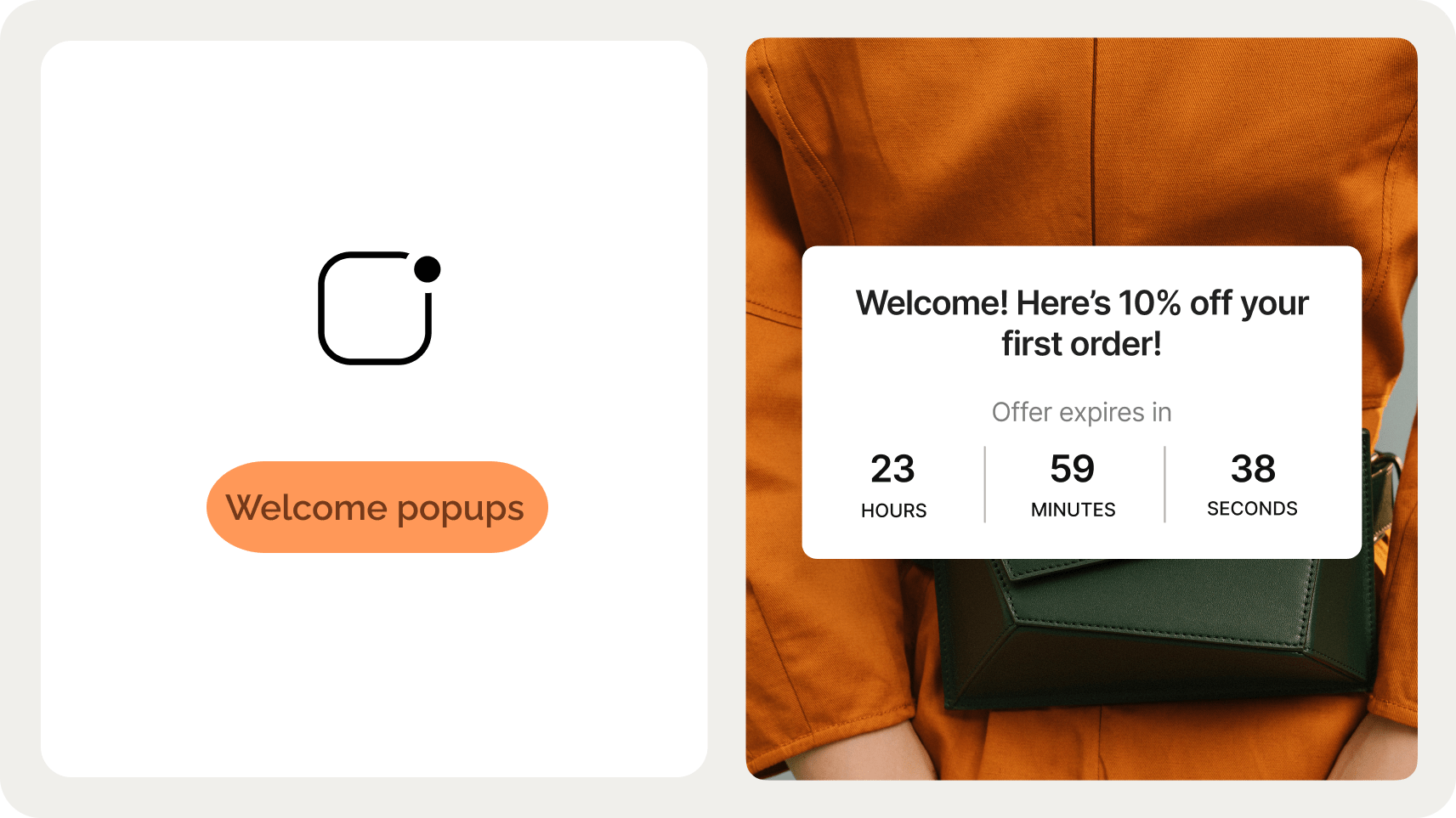
To learn about welcome popups, see inspirational welcome popup designs, and get a tutorial on how to create them, just scroll down.
See what I did there?
Just like this intro, a welcome popup is a message that greets new visitors to your website. It also has one super important goal: convert those new visitors into subscribers and customers.
In this post, you’ll find everything you need to make a welcome popup that converts visitors: examples, templates, tips, and a step-by-step creation guide.
Go to sections:
Launch a welcome popup that converts
Improve email capture, visitor engagement, and sales with welcome campaigns. Improve your CTR with deep targeting, AI triggers, and product recommendations.

What is a welcome popup?
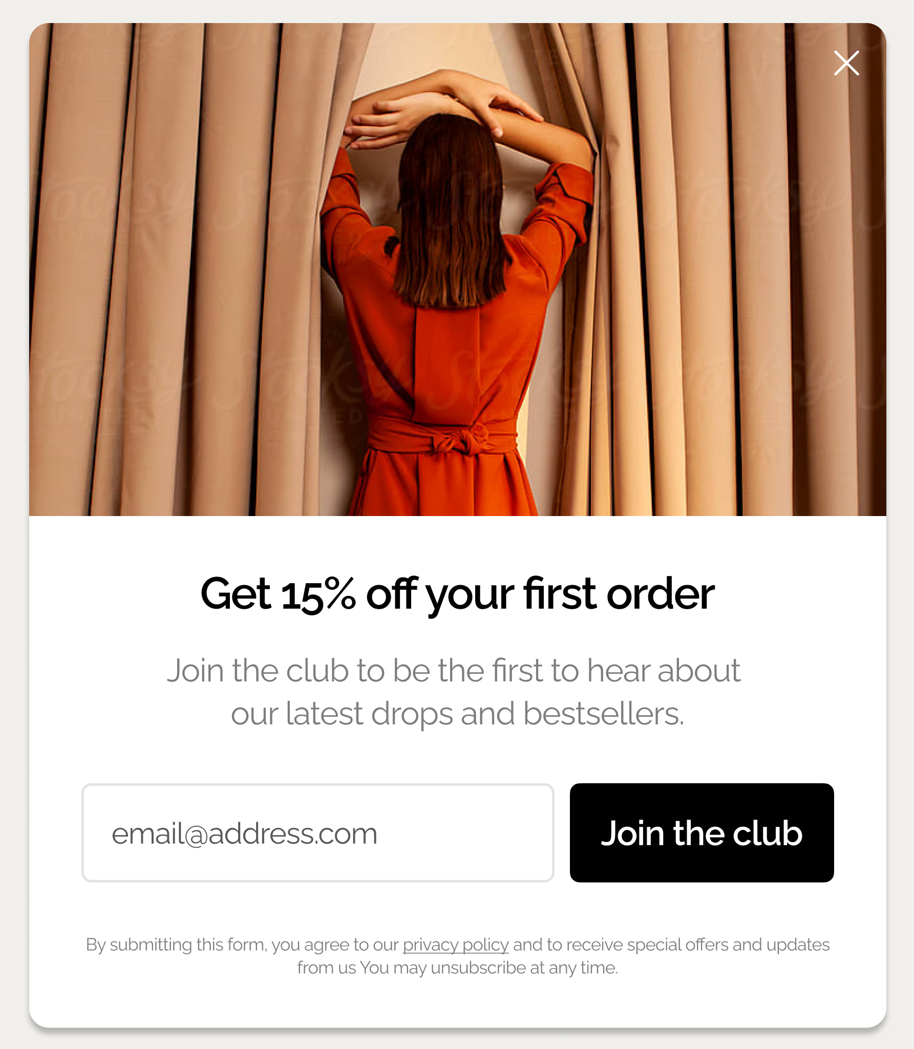
A welcome popup is a popup message that offers new and unregistered website visitors newsletter subscription, discounts, or other incentives to convert them into subscribers or customers.
Welcome popups with signup fields convert an average of 4.65% of website visitors in 2025, with top performers achieving conversion rates as high as 19.77%.
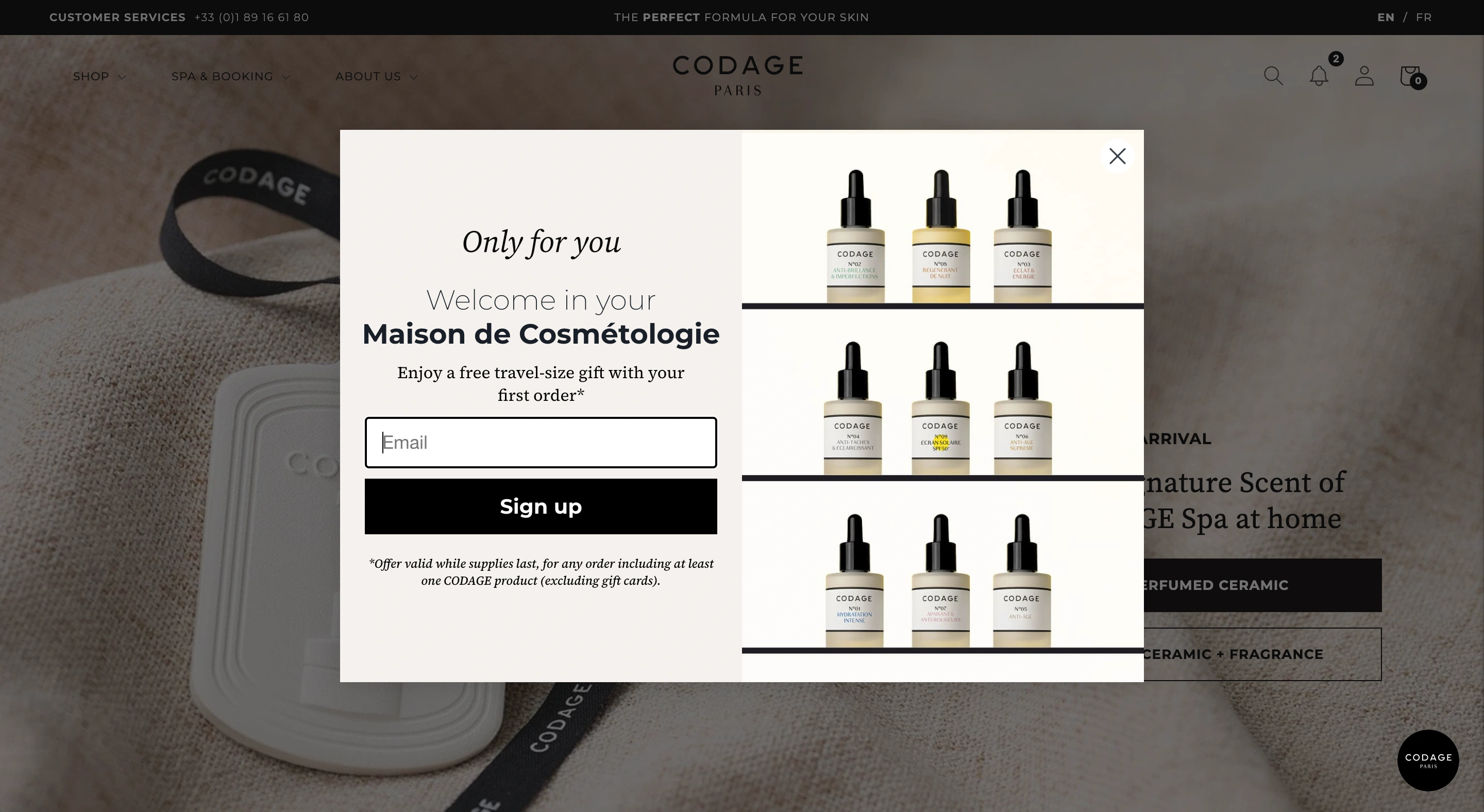
Here’s a typical welcome popup for email capture from an ecommerce website, offering an incentive for subscribing:

Common welcome popup formats include:
Email capture popups. Simple newsletter signups offering content, discounts, or exclusive access to sales
Discount offer popups. Contain first-time visitor discounts, free items, and other incentives for the first purchase
Content upgrade popups. Free guides, online tools, templates, or resources in exchange for contact information
Preference collection popups. Quick surveys asking about interests, shopping preferences, or product categories
Brand introduction popups. Highlight a brand's story and engage visitors by linking to pages that showcase its mission, values, and key projects
Announcement popups. They promote new product launches, sales events, or important brand updates
Video popups. Contain videos from brand events like fashion shows, founder-led content, and social projects
Build a 60-day popup roadmap that proves ROI
See how to create an implementation plan to turn your popups into a measurable growth channel.

Welcome popup performance benchmarks (2025)
Before diving into examples and strategies for welcome popups, we'll establish realistic performance expectations based on 2025 data.
Welcome popup type
Average CVR
Top 10% CVR
Key insight
Desktop welcome popup
4.65%
19.77%
Average conversion rate
Multi-step welcome popup
5.64%
20.65%
84% higher than single-step
With A/B testing
5.15%
22.02%
Minimum 5% CTR increase
Welcome popup templates
This playbook breaks down the highest-performing welcome popup campaigns we see ecommerce brands using today. Click them to see how they work.

Welcome Offer
Turn new visitors into subscribers with an instant discount + social proof

Email & SMS
Turn new visitors into subscribers and collect their emails + phone numbers

Discount Survey
Engage users with a survey that offers a discount as a reward
Examples of welcome popups
If you’d like some inspiration, let’s take a look at some amazing designs of welcome popups from popular websites. These examples are both great-looking and effective, converting up to several thousands of visitors every month.
1. Multi-step welcome popup with product recommendations
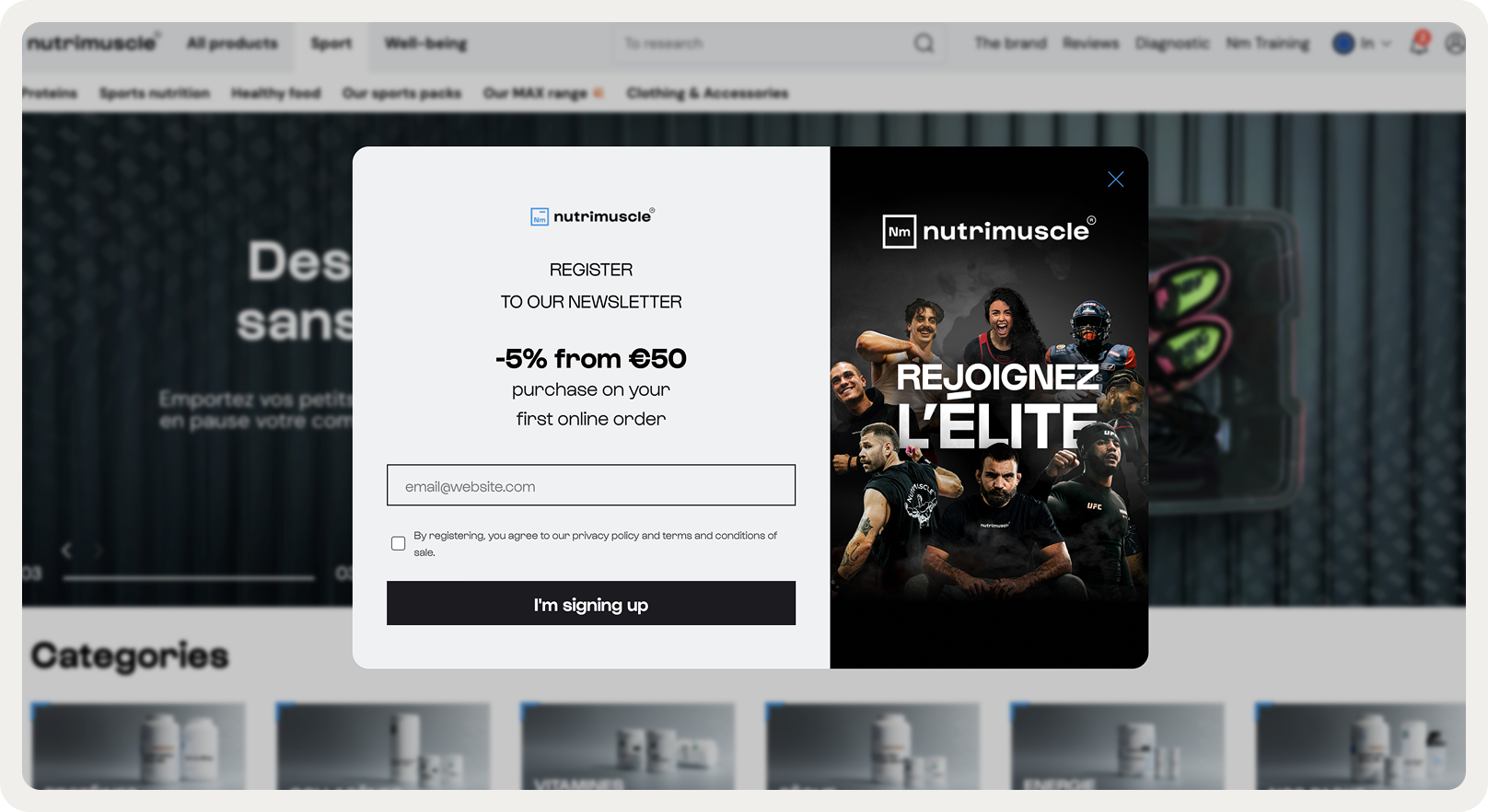



Website: Nutrimuscle
Goal: Build an email & phone number list; obtain lead qualification info and promote bestselling items
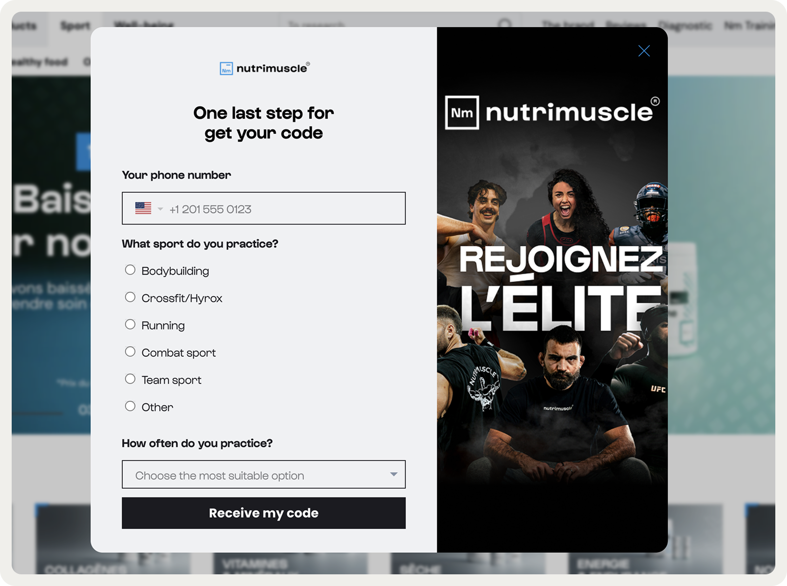
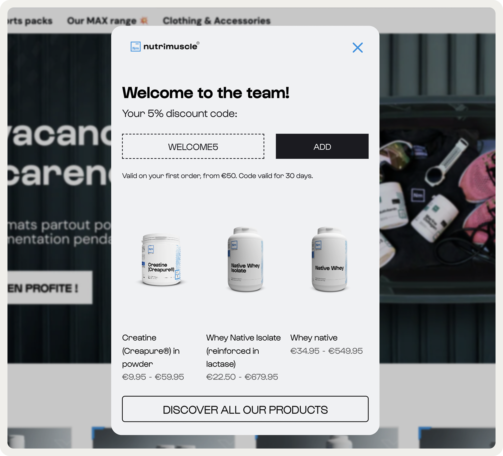
Nutrimuscle splits their welcome popup across three steps, starting with email capture for a 5% discount. The second step asks for phone and sport preference basic qualifying info that doesn't feel invasive.
By the time users hit the final screen, they're getting a discount code plus three product recommendations from their catalogue. This way, the brand collects emails, phone numbers, introduces bestsellers, and gets a chance to score a sale.
2. Multi-step email capture welcome popup
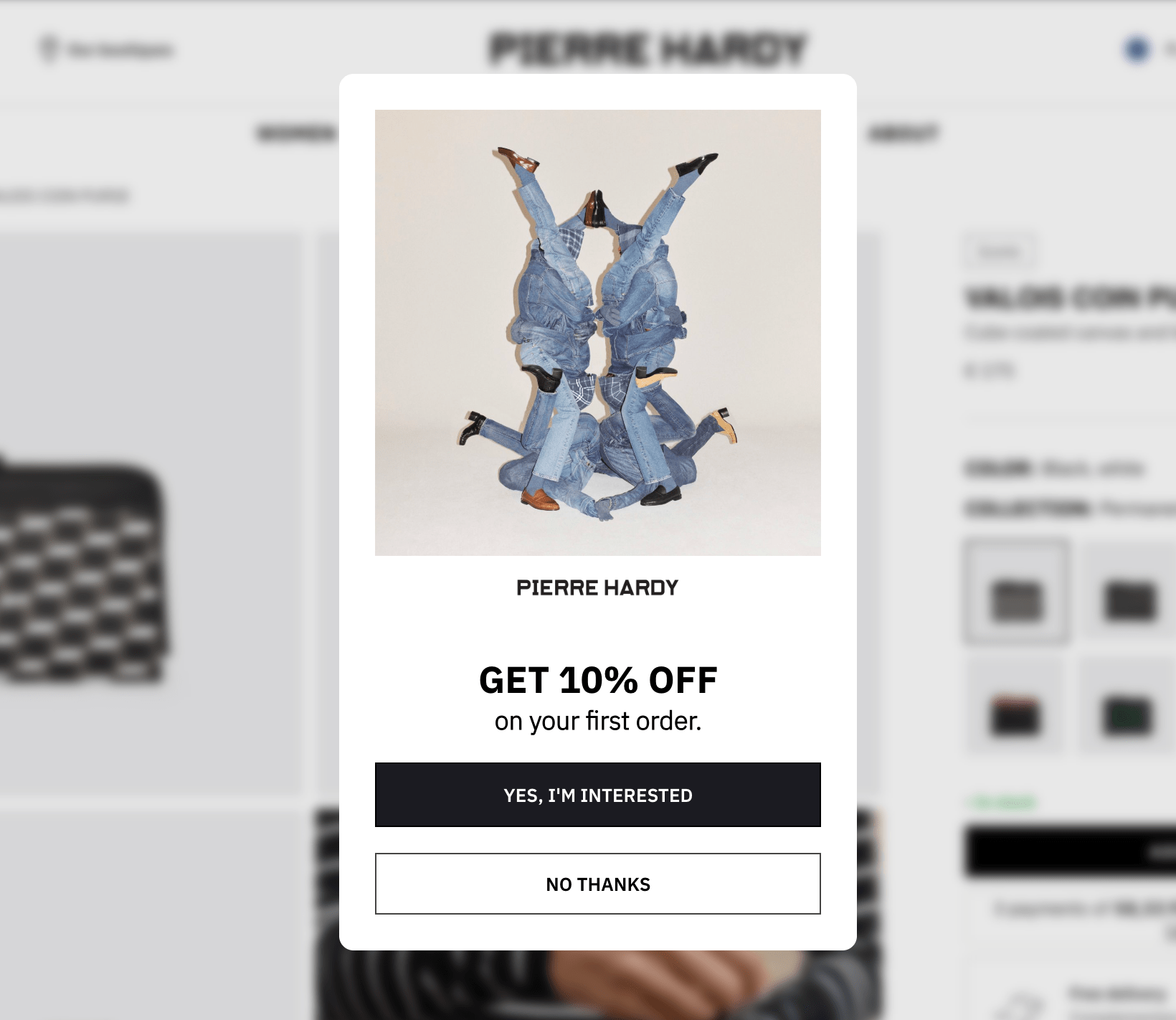



Website: Pierre Hardy
Goal: build email list; generate more first-time orders
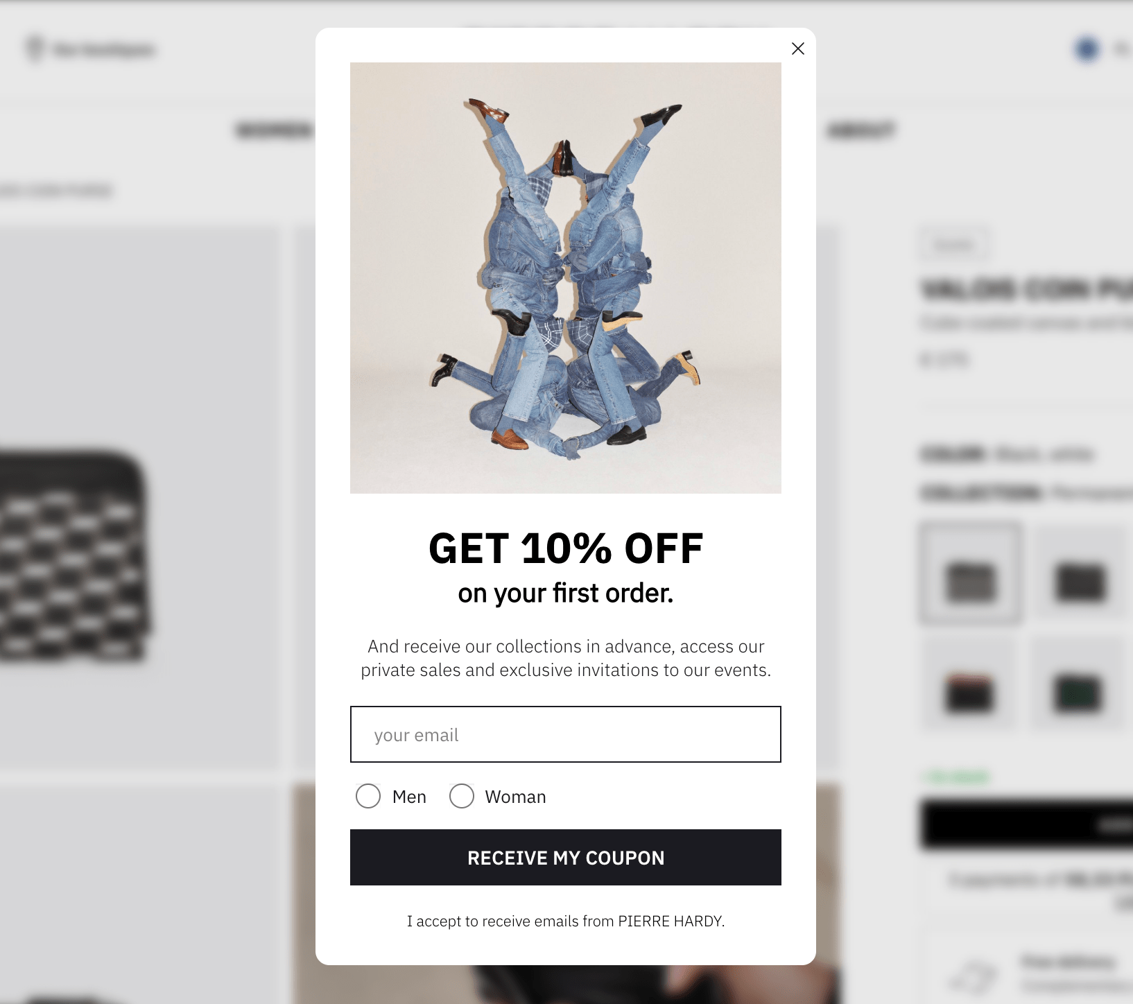
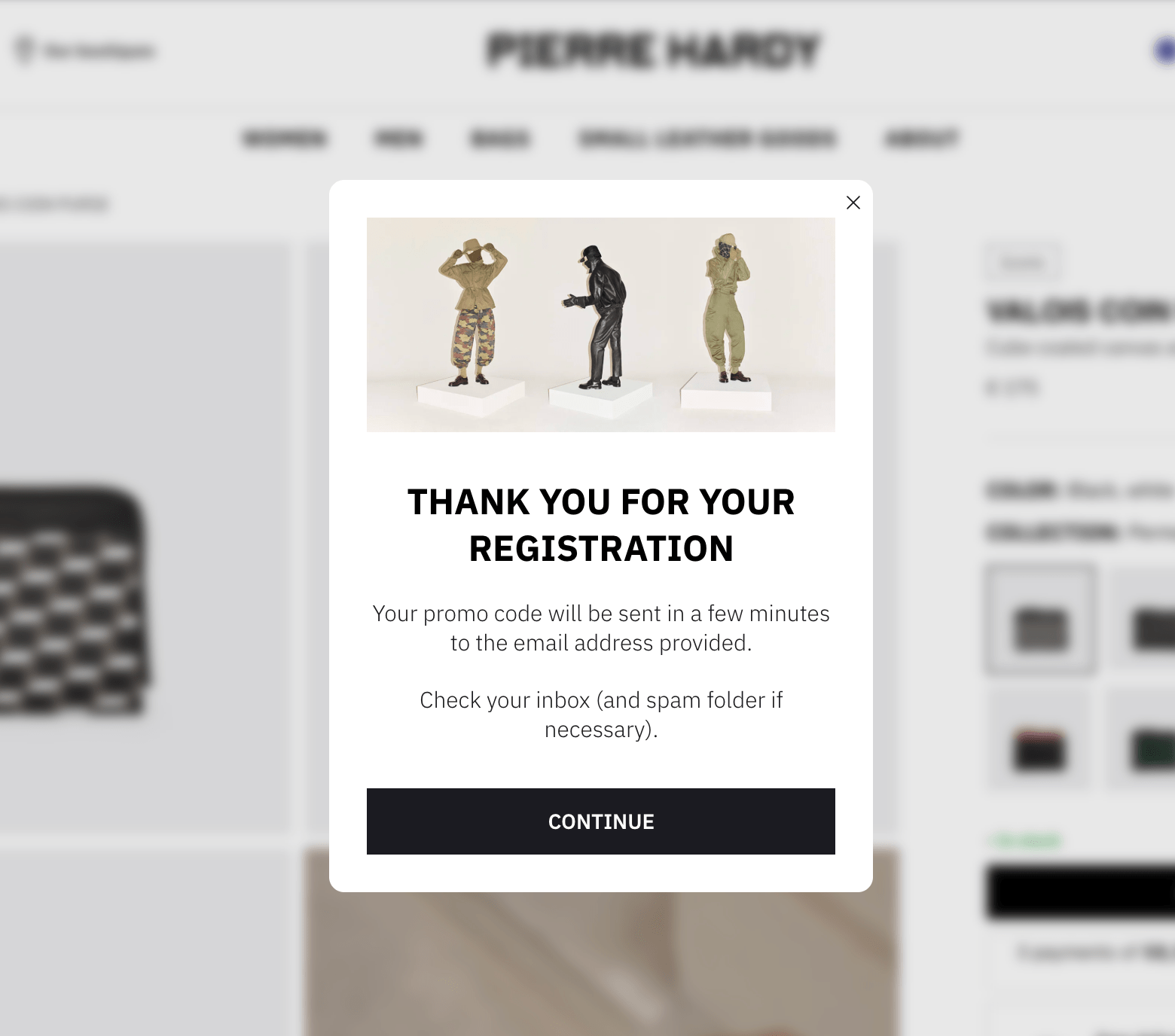
Pierre Hardy keeps their welcome popup lean. The first screen is pure offer and two buttons with contrasting styles. That's the so-called principle of micro-commitment in action: the first "yes" is an easy step that creates a small commitment that makes the next ask easier.
That is why they're consistently capturing 542 emails amonth; which suggests this multi-step approach is working specifically because of the micro-commitment psychology.
The second screen adds email and gender, then layers in additional perks (early access to collections, private sales, event invites). This works because the discount already won them over on screen one. The third screen confirms the signup with the detail that the code arrives via email, setting clear expectations.
Note:
The flow of Pierre Hardy's welcome popup is brilliant because:
starting with a simple yes/no question or choice that requires minimal effort from visitors
clicking "Yes" creates psychological commitment
visitors who engage with step one feel more invested in completing the process and getting the incentive
3. Welcome popup with a discount


Website: Blume
Goals: a) Build an email list, b) Generate more orders from first-time visitors
A nice welcome popup that gives away a discount for the first order. Many ecommerce stores rely on homepage welcome popups like this one to build an email list and get orders.
This welcome popup from Blume converts 5% of website visitors, which is way above the average popup conversion rate of around 4.01%. Reasons: a generous offer, cool-looking branded popup design, and a good brand reputation.
4. Welcome popup with a minimum order threshold to increase first-time buyer AOV


Website: Makerflo
Goal: Improve the average first order value
Makerflo's welcome popup copy is a great example of the value-driven copy: it goes straight to the point— sign up with an email for $10 off orders over $50. By setting a $50 minimum, the brand is nudging first-time buyers toward a higher order size.
This welcome popup example helped Makeflo improve their email capture by 18%. According to the brand's marketing team, it served as a starting point for generating leads and motivating them to browse more products.
5. Welcome email for lead capture to build a design-focused audience


Website: Vepsäläinen
Goal: build an engaged email list
Vepsäläinen uses page delay across all pages, showing this welcome popup only after users have scrolled or spent time on site. The ask is context-specific: "interior design tips and special offers," which resonates on product pages but also works for shoppers browsing collections.
Vepsäläinen is not promising a discount; they're offering interior design tips and personalized offers. The gorgeous product lifestyle image reinforces that connection. The 17% signup rate suggests the timing and offer was right.
6. Welcome popup with a software demo

Website: Zendesk
Goals: Increase demo views and generate leads
This welcome popup stood out to me for various reasons.
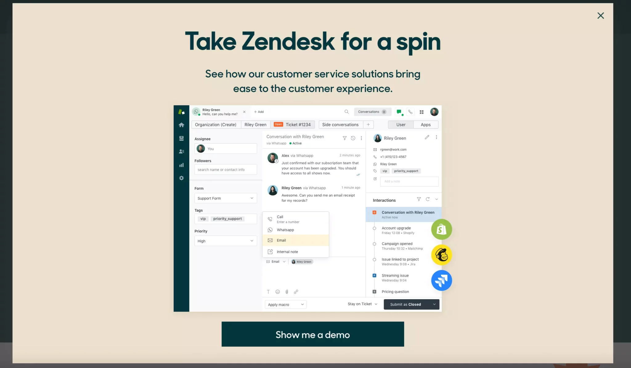
First, Zendesk is a software business, so the purpose of the campaign is to showcase the product in a demo session. Second, the popup makes the most out of the image, showing a screenshot of the product’s dashboard along with some popular apps it integrates with.
When visitors click on the CTA button, the site takes them to the demo signup page. There, they enter their name and email to begin watching the demo.
Overall, Zendesk gives us an awesome example of how website popups help software businesses generate leads and build awareness of their products.
More examples from software businesses:
7. Welcome popup that segments customers with product preferences before email capture

Website: Emma Sleep
Goal: Build a pre-segmented email list for nurturing with personalized emails
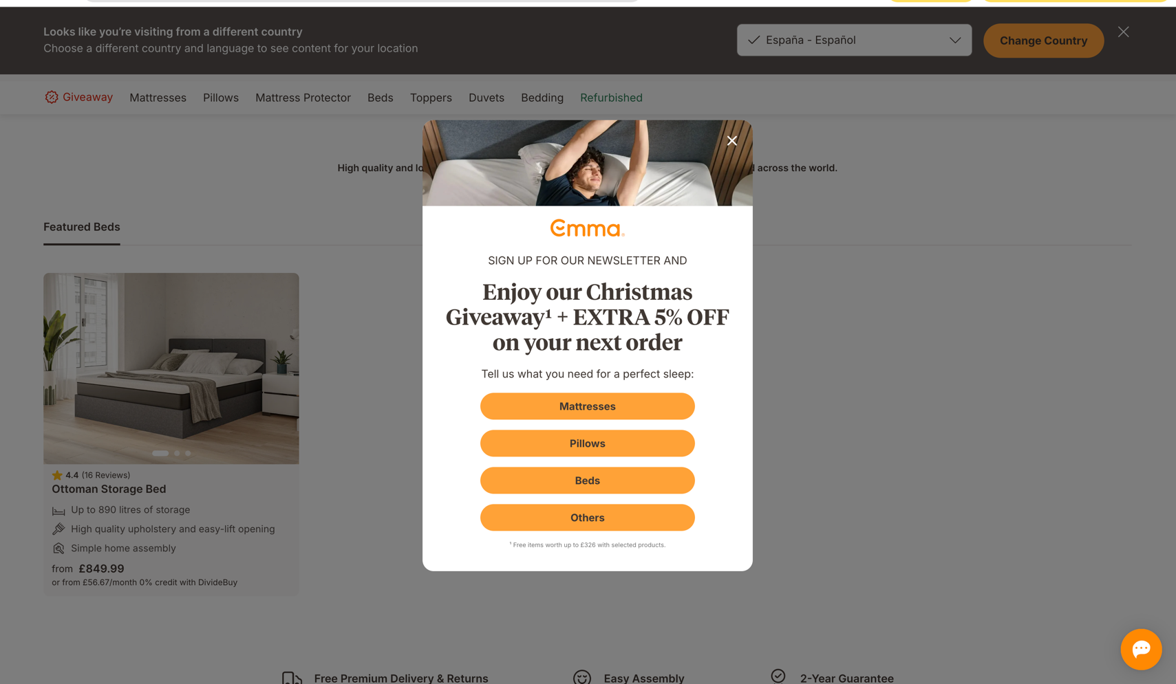
In this welcome popup, Emma asks users to pick a product category before capturing their email. This is again an example of the "micro-commitment" tactic in action.
By using this welcome popup best practice, you can build a pre-qualified list right away. Someone who selects "Mattresses" will naturally receive mattress-focused emails, giving you a better chance to get more emails opened. The seasonal incentive (Christmas giveaway + 5% off) also creates urgency without feeling desperate, and the lifestyle imagery keeps the focus on the actual product experience.
Consider this welcome popup design (multi-step with the product category selection in the first window) if you sell across multiple verticals (bedding, furniture, etc.) or have very different customer types. This will also help making your marketing emails be more relevant from day one.
8. Welcome popup with a spin-to-win wheel for email growth


Website: OddBalls
Goal: Expand email list and increase first-time visitor conversions
This gamified popup uses a spin-to-win wheel offering a 10% discount. Visitors enter their email, spin on-screen, and instantly see their code. The design is on-brand—vibrant pink, playful messaging, product imagery.
While this format converts 125% higher than standard welcome popups (average CVR: 10.15%), using gamification in welcome popup campaigns is recommended only during special periods like holidays, contests, or giveaways. Otherwise, spin-to-win attractiveness diminishes if used permanently.
How to create a welcome popup
Creating a welcome popup doesn't require coding.
Here are the steps to build and add a welcome popup on Shopify and other platforms:
Start a new campaign
Choose a template
Customize the design
Add the discount and product recommendations
Define when to show the campaign
Publish your campaign
We'll use Wisepops, a popup software rated 4.8 on Shopify and 4.9 on Capterra, used to make most of the examples you've seen above.
Grab a free account to get started:
No cc needed, free access for 14 days. See campaigns made with Wisepops


Step 1: Create a new campaign
Go to Create popup campaign in the Popups main menu:


Step 2: Choose a template
Select "Popup" as your format and your use case—they are presented in the left-hand menu.
I'll choose a Shopify template called "Welcome Offer Multistep Popup"—you can find it easily, too, by using the search bar:
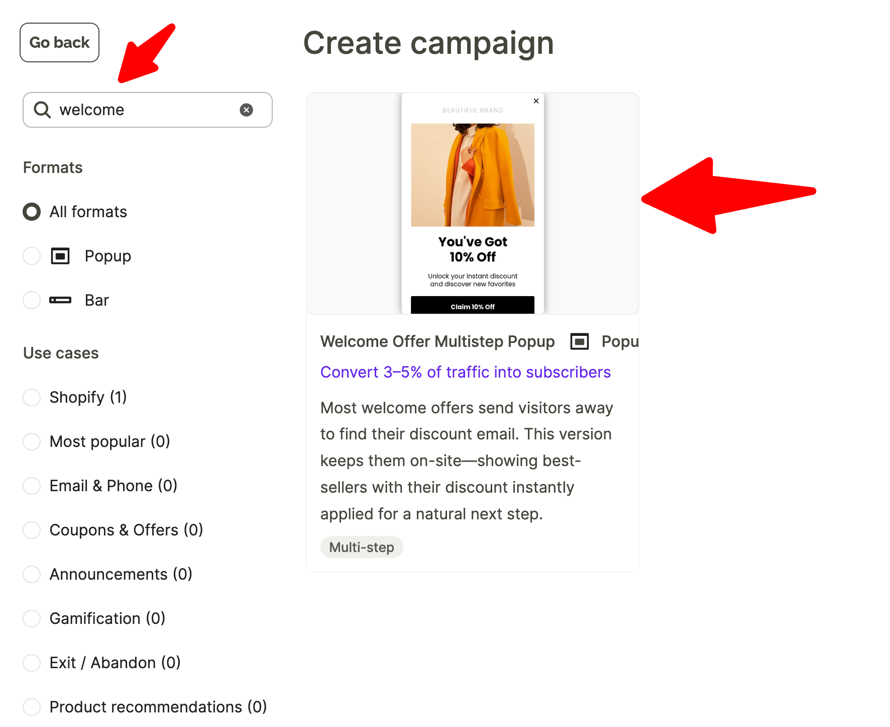

Why we are using a multi-step template for our welcome popup
Multi-step popups present information collection across multiple screens rather than asking for everything at once, which improves engagement and conversions.
Step 3: Customize the template design
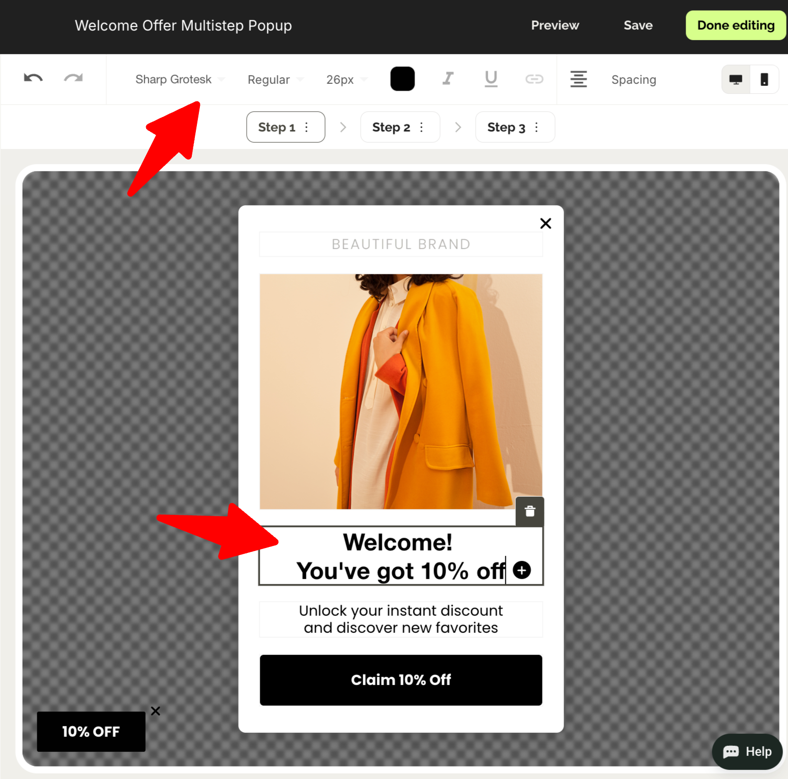
Customize the welcome popup you've chosen template to match your brand by taking these steps:
Click text elements to edit headlines, body copy, and button text
Keep copy short (2 sentences max) and action-oriented...

Design tips to maximize multi-step welcome popup performance:
Keep the first step simple: Text-only or a single question, no signups form fields
Make each step feel quick: Use short copy, large buttons, and clear next actions
Test 2-step vs 3-step: More steps can increase engagement but reduce completion rates
Use visual consistency: Maintain the same design language across all steps
Next—
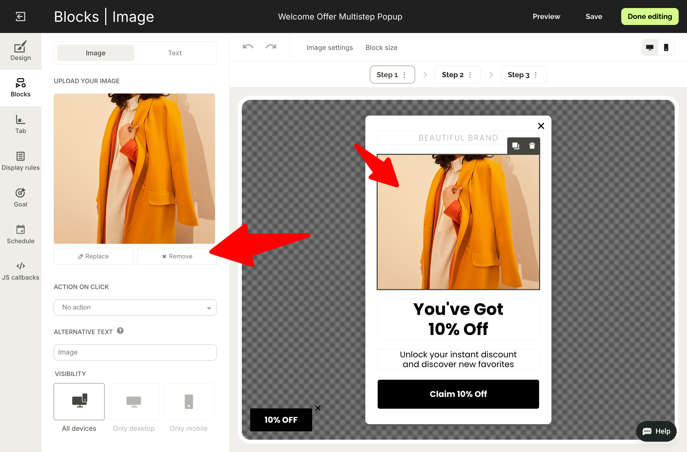
Replace images by clicking on them and selecting new ones from your library
Adjust colors, fonts, and spacing to align with your brand

Now, switch to Step 2.
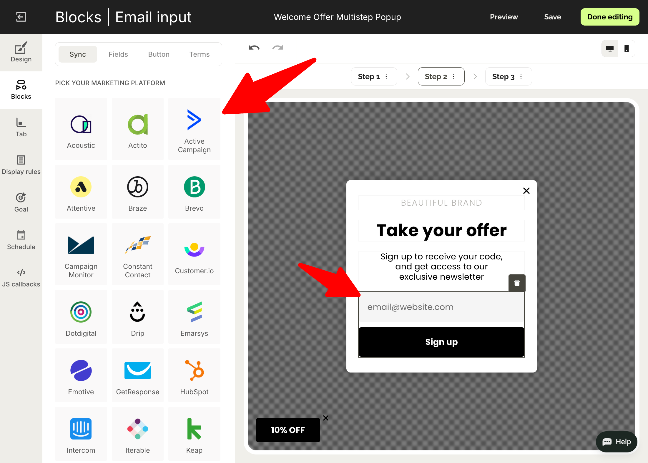
Customize the design and integrate your email marketing software so the new leads are sent there automatically:


To sync you email software, click the signup field and go to Sync tab in the menu on the left:

Did you know?
Thanks to the native Shopify integration, Wisepops tracks orders and revenue from your campaigns automatically.


Step 4: Add the discount code and product recommendations
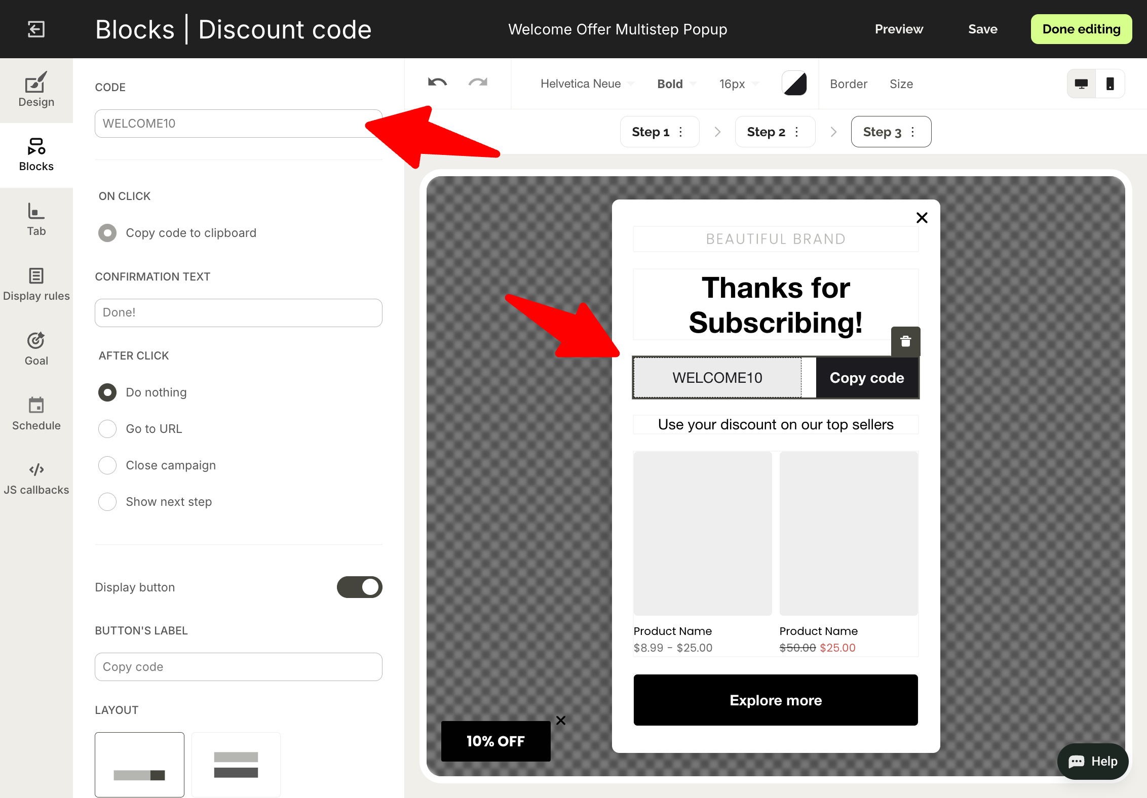
In Step 3, we share the discount code we promised earlier.
Choose the discount block and decide if you want to use a public discount (one that can be used by multiple customers) or a unique one:


When you choose your code (you can also sync your unique discount codes from your Shopify account) define what happens when a visitor clicks it, including copying to the clipboard or applying to the shopping cart:

Next—
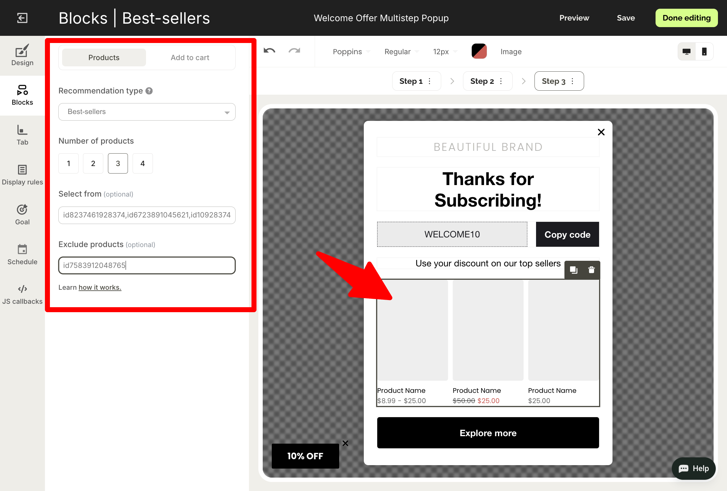
We want the customers to use the code for their first purchase, so let's suggest a few bestselling items for them to check out right away.
Click the product recommendation section and:
Choose Bestsellers as recommendation type
Decide how many items to show
Add ids of products you'd like the system to choose from (or exclude)

Learn if your welcome popup really brings sales and conversions
Do an A/B test with a control group and find what works best for your growth. Find this feature in Experiments.


Step 5: Define how to show your popup
Go to Display rules in the main menu.
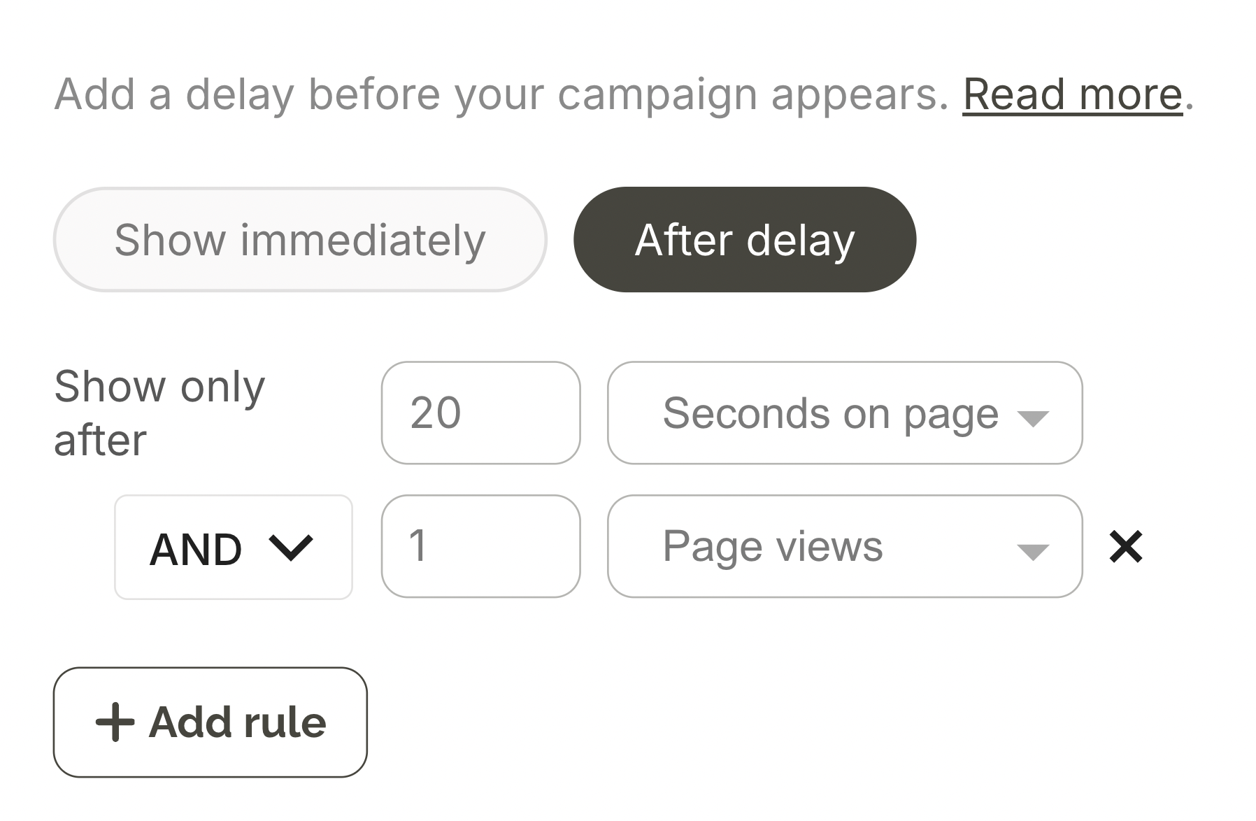
Popup research suggests that delaying welcome popups by at least 10 seconds and one page view can improve conversions by up to 30%, so let's follow this best practice.
In Display rules > trigger, add a 20 second and one page delay so the settings look like this:

How to set welcome popup for first time visitors only
In Wisepops, go to Display rules > Audience and select New visitors. This ensures your welcome popup only shows to first-time visitors, not returning customers who may have already signed up or made a purchase.
Also, you can choose to exclude your existing subscribers in one click.


Step 6: Publish your welcome popup
We’re done designing our popup, so hit Done editing. You’ll be redirected to the campaign overview window, where you click Publish and confirm.
If you've added Wisepops script to you website, the welcome popup should be published immediately.
Here are the step-by-step guides if needed:
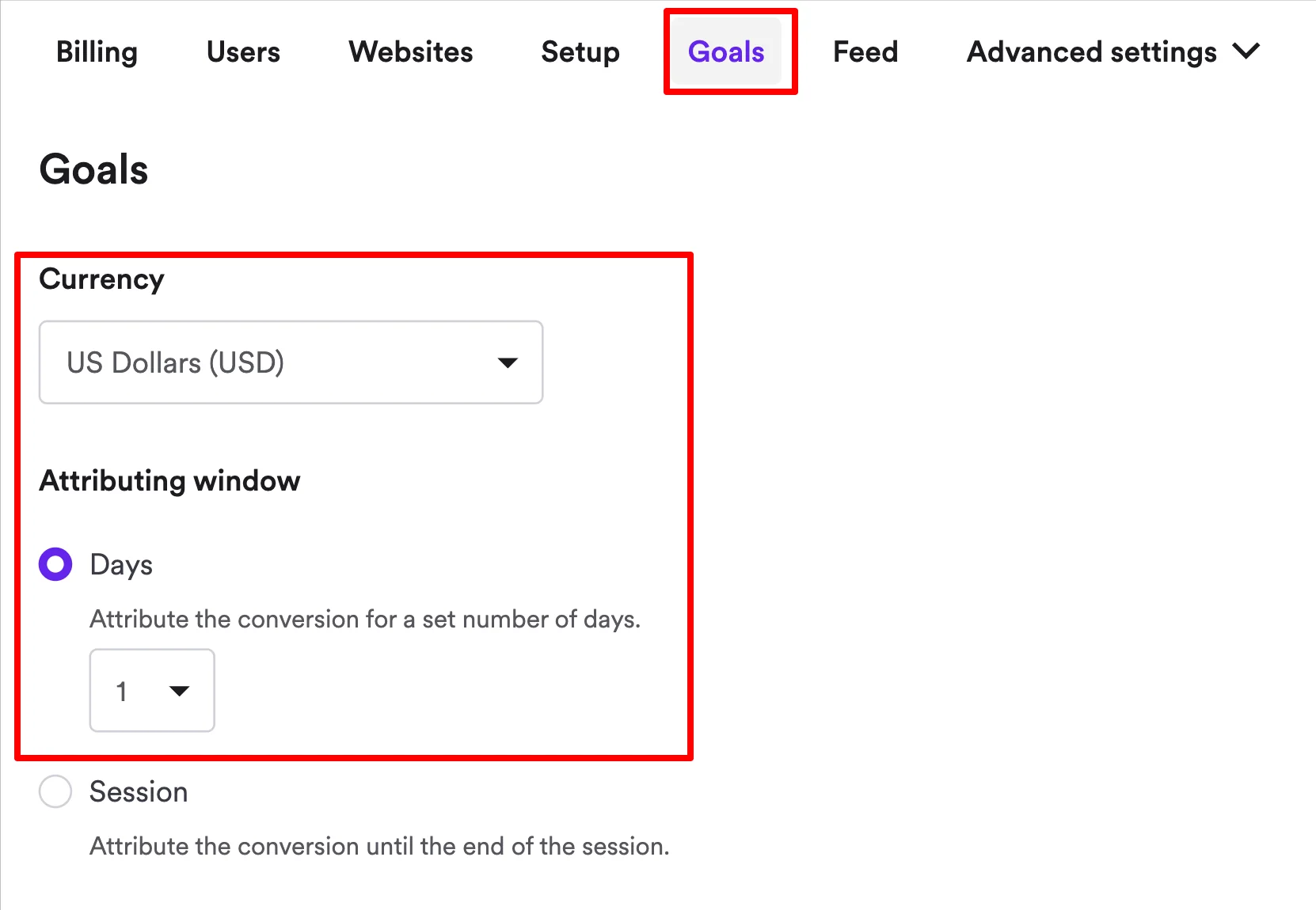
Once the popup starts receiving views and generating emails, you’ll be able to check the performance in the analytics dashboard (including clicks, CTR, attributed revenue, visitor reach, and more) and download your reports in CSV format:


Best practices for design, timing, triggers, and copy of welcome popups
Use these best practices to make your welcome popup a lead generation and sales machine.
Welcome popup timing: when to show your campaign for maximum conversions
Timing is the single largest lever for welcome popup optimization. Our data analyzing 1.8 million sessions shows that adjusting display timing produces median conversion uplifts of 39-52%—more than any other single optimization.
Here's how different timing strategies perform:
Timing
Email capture
Bounce impact
Immediate (0-5s)
High capture only for paid ad traffic
+500% bounce risk
20-50s delay
+20-43% email capture
-45% bounce reduction
One page delay
Highest quality subscribers
Minimal bounce impact
Scroll-triggered (50%)
Lower capture volume
Low bounce impact
Key insight:
The 20-50s delay offers the best performance for welcome popups because it reduces bounce by 45% and increases email capture by 20-43% on average. One page delay also captures the highest-quality subscribers with minimal bounce risk, but potentially can decrease the reach of your campaigns.
Why this tactic works:
Visitors have more time to evaluate your site, understand your value proposition, and build initial interest. So, the welcome popup feels less intrusive to them.
Welcome popup design and format best practices
Consider these tips for structuring the layout, making the design, and formatting your welcome campaigns for maximum conversions, as suggested by our research of 1.8 million popup sessions.
Feature
Best practice
Potential impact (average, ecommerce)
Format
Multi-step
+84% higher conversion vs single-step format
Number of signup fields
One field only
+79% better than 5-field form
Gamification
Spin-to-win wheel
+125% higher engagement vs traditional if used for special occassions
Countdown timer
24-48 hour expiry
+41% conversion uplift
Copy approach
Quantified value ("Get 15% off")
Wins 68% of A/B tests vs emotive language
Discounts
Specific percentage + timer
Top-converting incentive format
Product images
Use product/lifestyle images
5% conversion vs 2.85% without
Personalization
URL + behavioral targeting
+163% conversion improvement
Note on advanced behavioral targeting
Consider these tactics to personalize your welcome popups by visitor behavior.
Cart value
Show different welcome offers based on cart contents:
Low cart value ($0-25): Percentage discount to increase order size
Medium cart value ($25-75): Free shipping threshold messaging
High cart value ($75+): Premium offers, VIP program invitations
Browsing behavior
Trigger popups based on engagement signals:
Multiple product views: "Still deciding? Get 10% off to help you choose"
Time on site (2+ minutes): "Enjoying your visit? Join our VIP list for exclusive deals and first-order discount"
Multiple product views: "Take our product quiz and choose the best product for you in 3 minutes"
Mobile-specific best practices for welcome popups
Using mobile popups, too? These tips will help you design a high-converting campaign right away.
Optimization area
Best practice
Potential impact
Timing delay
Add 10-15s to desktop timing
Timing trigger reduces friction, so it's better for mobile visitors
Full-screen layout
Use Full-screen format on mobile
+48% email capture (top-funnel), but -18% mid-funnel conversions
Close button
Top-right corner, 44x44px minimum + a secondary textual option to close, eg. "no, thank you"
Essential for UX, prevents mis-taps
Copy font size
Minimum 16px
Essential for UX; Prevents iOS auto-zoom on tap
Traffic source display timing
Paid traffic (0-5 s delay), Organic (20-50s delay), Direct (test both)
Adjust based on visitor intent
Headline length
Keep it under 40 characters (6-7 words)
Longer headlines wrap awkwardly and lose impact on small screens.
Main copy
Limit to 1-2 short sentences max
Mobile users skim aggressively, so short copy gives a better chance to convert.
Images
Minimize or remove using your tool's block visibility feature
This helps to save screen space needed to ensure that the copy is readable and the button is large enough
Get started
in minutes
Start converting more visitors today.
Get started in minutes and see results right after.

